The One with the Thoughts of Frans

Archive for Browsers

Opera 11 Addressbar Revisited

I already wrote down some thoughts about the addressbar changes in Opera 11 a few days ago, and it got me thinking that the addressbar could definitely be improved, just not by detracting from it.

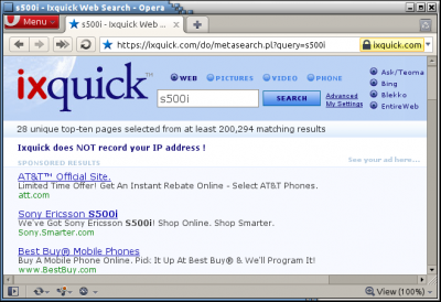
To cut to the chase, here’s the addressbar I’m envisioning:

What you see on this screenshot, however, does not tell the whole story. Let’s start with what’s visible:

  • The protocol is grayed out. This is the method that most so-called URL highlighting uses to emphasize the domain. I think this is the wrong approach, but in the case of the protocol it seems the right thing to do. It is somewhat hidden, but still fully visible: no need to select the addressbar to find out what protocol is being used. People know that something is a web address when they see it in print thanks to the protocol, even if they have no idea what it means (and in fact many might mistakenly interpret HTTPS as safe), and combined with the large, clear button indicating security information you’d really have to try to misinterpret HTTPS as safe.
  • The domain is highlighted, specifically by bolding in this example, but it could also be done through underlining, a background color, or a combination of various things. The important part is that the domain is highlighted, rather than the rest of the URI lowlighted.
  • Query strings have parameter highlighting, and characters that separate parameters like ? and & are hidden and replaced by a small outline indicating what goes with what. The space between the various parameters corresponds to the size of the hidden ? or & characters and thus no shifting will occur when selecting them. I did not look into things like color blindness and the colors I used are solely for illustration purposes; they are no suggestion for specific colors.

Then, what’s not visible:

  • Complex query strings, meaning with 3 or 4 parameters or more, could be hidden from that point on, but this should be visibly indicated. An ellipsis is the standard method of conveying such information, so there’s no need to come up with something fancy. A complex query string like Google’s would thus look something like http://www.google.be/search [client=opera] [rls=en] [q=test]…

    Perhaps the number of parameters before hiding occurs should be configurable as well.

    This hiding should not affect links to IDs like #someID, which are hidden along with the query string at the moment.

  • Linkify URI segments on hover when a modifier key, such as Ctrl or Shift, is pressed. This has been implemented quite nicely by the Firefox extension Locationbar².

That’s about it for my proposal regarding how to truly upgrade the addressbar as opposed to trying to make it little more than a domain display.
Comments (4)

What’s Wrong With the Opera 11 Address Bar, And How to Fix It.

Opera 11 made some drastic changes to the addressbar. I think the thought is good, but the execution leaves quite a bit to be desired.

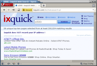
Opera 10.63

Here you can see the classic method as it is in 10.63: full URL. You could say that the security information is somewhat detached on the right.

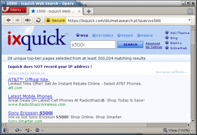
Opera 11

This is Opera 11, with the changed addressbar. The favicon is removed, the protocol and query string are hidden, and the security information is made more prevalent.

Generally speaking I don’t care too much about http vs. https; secure vs. insecure certainly is a better way of presenting that, lest https give you a false sense of security. Then again, I think that keeping the protocol and simply moving the security indication to the spot of the favicon (while still getting rid of that) would’ve accomplished the same effect better without losing out on such information. After all, if I notice some site uses https, but is insecure, I should probably notify the site, right? The lack of something like ftp is slightly more annoying, but the lack query strings is the absolute worst. I realize that some query strings can be overly complex, but I fail to see why the lowest common denominator should get rid of the good query strings as well. Seeing or not seeing it is only part of the issue: it also kills the ability to easily select the relevant part of the query string that you want to change (like a search term).

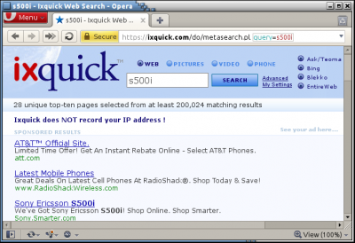
Opera 11 as it should be

And here is my combination of both. Remove the favicon, which might give a false sense of being on the real site (and is already visible on the tab), and move the security information to where the favicon used to be. The rest of the URL can remain fully accessible, displaying information for those who can use it. Domain highlighting can take care of those who have trouble spotting the domain they’re on (and on Windows it already does, making the removal of the query string even more peculiar). No extra step is necessary to select parts of the URL.

I feel that this is a fair compromise: it makes the security information more accessible without compromising existing functionality.

Comments (1)

Damn, It Is Cold

Weather in fall always comes paired with temperature drops, fall storms, and lots of rain. But seldom did the temperature drop from 20°C to a mere 7°C from one day to the next.

The release of Ubuntu 10.10 coincided with this change for wintry weather; however, while I’m sure it’s swell, you won’t see me upgrading just yet. Perhaps I’ll have to look a little harder into acquiring a netbook so I can use it with the Ubuntu Netbook Edition.

Of more interest is the announcement that Opera 11 will have extensions. Or, more particularly, that I was the first to guess this in a contest.

Comments

How to Disable Opera Speed Dial

As far as I’m concerned there are two reasons for disabling speed dials: it’s faster, and your history doesn’t misbehave.

The speed is less relevant since Opera 10, although more relevant again since Opera 10.50. The history argument is far more important to me. It really throws me off that the first page I visited in a window still allows me to go back. I don’t know why someone would want to go back to the speed dial; isn’t it faster to just open a new one?

To disable the speed dial, you have you change the SpeedDialState setting in opera:config.

0: Folded
1: Shown
2: Read only, and always show speed dial
3: Disable speed dial

Set it to 3 to disable speed dial completely. If you think this will impair your ability to open pages quickly and easily, you need to take note of go to nickname (Shift + F2).

Comments

What Is A Tab?

Recently I’ve noticed some ignorance regarding what constitutes a tab, largely fueled by the announcement of the badly-named Tab Candy. Panorama is a much better name.

To clarify what a tab is, I looked for a random picture of a tab and added a circle around the tab.

If those tabs aren’t there in some kind of metaphorical pixel-form, there are no tabs. Or to put it another way, a tab-based user interface consists of multiple internal windows with a sort of task bar.

CommentsTags:

Opera and Link Targets

If you’re like me and you aren’t particularly fond of sites opening in new tabs without your explicit command, you might be interested in activating Opera’s Ignore Target setting. This setting “Unfortunately … also disables the window.open() method, breaking the functionality of many sites,” so you might prefer to utilize JKing’s UserJS which stops most links from opening in new windows.

On the other hand, you might prefer all links to external sites to open in a new tab. I recently wrote a script that does just that for someone on the MyOpera forum.

Comments

The Way Alternative Text Should Be Rendered

Vlad Alexander describes how browsers mess up horribly on alternative text. I noticed the deficiencies in Opera and Firefox before, but what Webkit does is simply ridiculous. I don’t entirely agree with him since I don’t think that the alternative content should display without any indication that it’s alternative text whatsoever. I consider Opera’s behavior best in this regard (as opposed to the obtrusive icons most other browsers throw in there), except for the part where it applies width and height meant for images to the text thus cutting them off.

Comments

Opera 10.50

For those of you who read my blog, use Opera and don’t follow the latest releases, Opera 10.50 for Windows was released yesterday. Download it now!

Comments

30 Days to Becoming an Opera Lover

The 30 Days to Becoming an Opera 6 Lover series may very well have been what pulled me over the edge. That which made me choose Opera instead of MyIE2 (now Maxthon). It should therefore be no surprise that I still harbor warm feelings toward it. While it may be old, and the original series is no longer hosted by TnT Luoma as far as I can tell, I think that the series could still teach current (aspiring) users of Opera a thing or two — even the 30 Days series for Opera 6. Due to the large part the Opera 6 series played in my personal discovery of Opera, however, my judgment may be somewhat impaired.

I dug into the Internet Archive and I was pleasantly surprised to discover that the 30 Days series for Opera 6 is available through the archive in a nice ZIP file. The original Opera 6 lover pages do not seem to have been preserved, but the ZIP file is easier to use regardless.

The 30 Days series for Opera 8 was also preserved.

While I would not recommend a detailed read (it is quite outdated after all), I would certainly recommend skimming through most of it.

By the time Opera 8 came out — and consequently, the 30 Days to Becoming an Opera 8 Lover series — I was already a seasoned Opera user, so the series didn’t do much for me. I did discover one very important Opera feature thanks to it, however. In the default keyboard setup, Shift + F2 is bound to go to nickname. If you don’t know what nicknames are, you can give bookmarks so-called nicknames; if you type them out in the address bar and press enter it will take you to the bookmark, and it will offer autocomplete suggestions while you’re typing. Useful, but not a huge time saver.

Go to nickname is better, because it starts going to the nickname as soon as it’s got a match. So if you have only one bookmark with a nickname that starts with a, you’ll only have to type a and you’ll be on your way. I had not realized this prior to reading the Opera 8 Lover series, and it wasn’t actually written in the series, but without it I might very well never have tried this feature again. After some consideration and major inspiration by Moose I rebound F2 to new page & go to nickname, which means that ever since, pressing F2 automatically opened a new page and this tremendously useful dialog. The introduction of speed dial didn’t do much for me thanks to this keyboard shortcut. It might take a few seconds more to configure, but it’s worth it. Additionally, new tabs will open even faster if you disable speed dial.

Comments (1)

Extend Opera

ExtendOpera.org was launched a few days ago. It’s a user initiative, aimed at bringing those aspects of Opera customization that Opera software has somewhat abandoned together.

Comments

« Newer EntriesOlder Entries »